

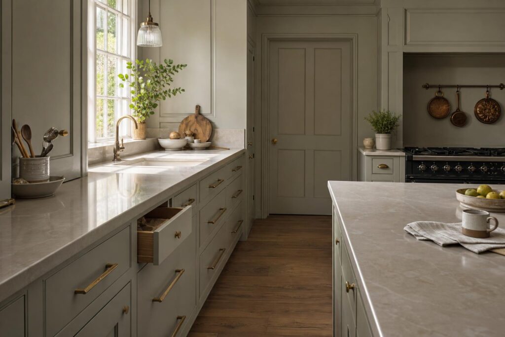
Monochromatic kitchen design is getting a lot of attention in 2026, and it is easy to see why. A kitchen where the cupboards, walls, trim and sometimes even the ceiling sit in the same colour family can feel calm, tidy and very grown up. The honest truth is that it can also look flat, heavy or unfinished if the joinery is not doing enough of the work.
That is the bit homeowners need to understand before choosing a single-colour kitchen. The colour is only part of it. The success of the room comes down to proportions, cabinet detail, shadow lines, finish, handles, worktops, lighting and how well everything is fitted. A good joiner will tell you that one colour can hide very little. If the doors are poorly aligned or the panels are badly planned, you notice it every day.
Why monochromatic kitchen design is having a moment
A lot of people are tired of kitchens that feel busy before anyone has even made a cup of tea. Open shelves, mixed metals, patterned tiles, contrasting islands and statement splashbacks can all look brilliant in the right house, but they can also make a family kitchen feel restless. Monochromatic kitchen design goes the other way. It strips the palette back and lets the room feel quieter.
The current version is not the stark white box many of us remember from a decade ago. In 2026, the best one-colour kitchens tend to use warmer, softer shades: putty, clay, mushroom, soft green, warm grey, deep blue, chalky off-white or earthy brown. The finish is usually matt or eggshell rather than shiny. It feels more built-in and less like showroom furniture.
In our experience, this works especially well in UK homes where the kitchen sits open to a dining or living space. A calmer palette helps the kitchen belong to the rest of the house, rather than shouting from one end of the room.
Why one colour needs better joinery, not less
There is a common mistake with monochrome kitchens. People assume that because the colour is simple, the cabinetry can be simple too. That is usually where it starts to go wrong.
When you remove contrast, you need detail somewhere else. That detail does not have to be fussy. It can be a proper shaker rail, a neat inset door, a framed end panel, a carefully proportioned plinth, a slim open shelf or a small change in depth around a chimney breast. These details catch the light and give the kitchen shape.
Flat, badly fitted doors in one colour can make a kitchen feel like a wall of boxes. Proper bespoke joinery gives it rhythm. It lets the eye read the room without needing lots of different colours and materials.
The details that make a one-colour kitchen work
If you are planning monochromatic kitchen design, these are the details worth discussing before anyone orders materials:
- Door style: shaker, slab and beaded doors all behave differently in one colour. Shaker often gives the best balance of calm and character.
- Panel layout: end panels, tall units and appliance housings need to look intentional, not like filler pieces.
- Shadow lines: small changes in depth create definition without needing contrast.
- Handles: brass, bronze, black or painted wooden handles can change the whole feel of the room.
- Worktops: stone, timber, quartz or compact laminate can either soften the scheme or sharpen it.
- Lighting: wall lights, under-cabinet lighting and natural light decide whether the colour looks warm or dull.
Worth getting right the first time. A one-colour kitchen is less forgiving than people think because the eye goes straight to the fit and finish.
Should the walls match the cabinets?
Matching the walls to the cabinets can look excellent, but it is not always the answer. In a small kitchen with limited natural light, taking the same colour across every surface can make the room feel closed in. In a brighter room, it can make the kitchen feel properly built into the house.
A good middle ground is to keep the cabinetry in one colour and take the walls a shade lighter or darker from the same family. You still get the calm effect, but the room has a bit more depth. Another option is to match the walls and tall cabinetry, then let the worktop and flooring bring in natural texture.
The ceiling matters too. Painting it the same colour can work in rooms with height, but in lower kitchens it can feel heavy. There is no rule that works for every house. The right answer depends on light, ceiling height and how much cabinetry is going into the space.
Where bespoke fitting earns its keep
Monochromatic kitchen design often looks best when the kitchen feels like part of the building. That is where bespoke fitting makes a real difference. Older UK homes rarely have perfectly straight walls, square corners or standard spaces. If you are trying to create a calm, measured look, gaps and awkward filler strips will spoil it quickly.
Bespoke joinery lets the cupboards work with the room. Tall units can be built to suit the ceiling height. An island can be sized properly for how the family moves around it. Awkward alcoves can become useful storage instead of dead corners. Panels can be made to line through, rather than stopping wherever the nearest standard cabinet size runs out.
That is the difference between a kitchen that is simply painted one colour and a kitchen that feels properly considered.
Choosing the right colour for real life
The best monochrome kitchen colour is not always the one that looks best on a phone screen. Paint changes massively depending on daylight, artificial light, flooring and worktop choice. A green that looks soft in a showroom can look cold under north-facing light. A warm neutral can turn yellow next to the wrong timber floor.
We always suggest looking at proper samples in the actual room, at different times of day. Hold them next to the worktop, handles and flooring. If the kitchen is being hand painted, ask about finish and durability too. A beautiful colour is no good if it marks every time someone opens a drawer with flour on their hands.
Is a monochromatic kitchen too trendy?
Not if it is done properly. The trend might be new in the magazines, but the idea is not. Traditional fitted furniture has often used one strong, well-chosen colour across cupboards and surrounding woodwork. What dates quickly is not the single colour. It is poor proportions, cheap materials and a room that has been copied without thinking about the house it is going into.
If you keep the joinery honest, choose a colour that suits the room, and avoid gimmicky finishes, a monochromatic kitchen can age very well. It gives you a calm base that can change with smaller details like lighting, stools, artwork, blinds and hardware.
Final thoughts on monochromatic kitchen design
Monochromatic kitchen design is a strong look for 2026, but it is not a shortcut. It asks more from the joinery, not less. The colour may be quiet, but the craftsmanship needs to be doing the talking.
If you are planning a new kitchen, think beyond the paint chart. Look at the cabinet proportions, how the units meet the room, where the shadows fall, how the worktop breaks up the scheme and whether the fit will still look sharp in ten years. That is what makes the difference between a passing trend and a kitchen that feels good to live with.
Thinking about a new kitchen or bespoke joinery project? Give BH Bespoak a call on 07904 794280 or message us on Facebook. We are always happy to talk through what will work in your home.