

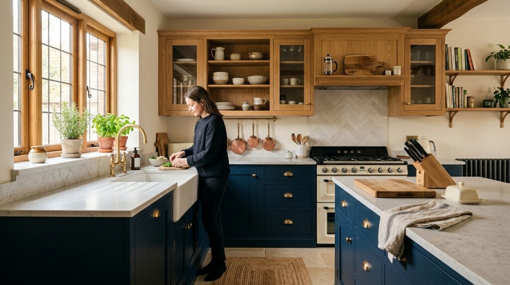
Two-tone kitchens are having a proper moment right now, and for good reason. After years of all-white everything followed by the all-navy backlash, homeowners are landing somewhere far more interesting: one colour on the lowers, something completely different on the uppers, and the whole room suddenly feels considered rather than off-the-shelf.
If you’ve been looking at kitchens online lately, you’ve likely spotted this combination doing the rounds. Deep painted base cabinets paired with natural timber wall units. Or sage green below and creamy off-white above. Sometimes the contrast is subtle; sometimes it’s bold. Done properly, it transforms a kitchen from a functional room into one that actually has character.
Here’s what you need to know before you commit to it.
Why Two-Tone Works So Well in a Kitchen
Kitchens have a lot going on visually. Worktops, splashbacks, appliances, handles, flooring. A two-tone cabinet scheme gives you a structure to hang everything else off.
The logic is simple: darker or richer colours sit better at a lower height, where they ground the room without closing it in. Lighter tones or natural materials at eye level and above keep things feeling open and airy. It mirrors the way good interior designers have always thought about rooms — weight at the bottom, lightness above.
There’s also a practical argument for it. Base units take a hammering. Doors get touched constantly, kicked, knocked by chairs. Going darker on the lowers means everyday scuffs are less visible. Your uppers, which get handled less, can afford to be lighter without looking tired after two years.
The Combinations That Are Working Right Now
Not all two-tone combinations are created equal. Some look genuinely considered; others just look like you couldn’t make up your mind. Here are the pairings we’re seeing clients drawn to at the moment:
Navy or Slate Blue Lowers with Oak or Walnut Uppers
This is the combination that’s generating the most interest right now. A deep, slightly muted navy on the base cabinets with warm natural timber on the wall units. The contrast is strong but the materials complement each other — cool and calm below, warm and organic above. Pair it with a pale honed stone worktop and brass hardware and you’ve got a kitchen that looks like it cost twice what it did.
Forest Green Lowers with Soft White or Cream Uppers
The green kitchen trend has been running for a few years now, but this pairing gives it a fresh angle. Moving the green to the base cabinets and lifting the uppers into a warm cream or off-white keeps it feeling light. Works especially well in kitchens that don’t get a huge amount of natural light, where all-green would feel heavy.
Charcoal Lowers with Warm Linen Uppers
For anyone who finds navy or green too bold, charcoal is a more neutral way into two-tone. It reads almost as a very dark grey, so it plays well with a huge range of worktops and flooring. Linen or light stone uppers soften it without going full contrast.
Where Bespoke Makes the Difference
This is where I’d push back on the idea of doing a two-tone kitchen with off-the-shelf units.
Standard kitchen ranges are designed to be sold as a system. Mixing across ranges, or mixing a painted unit with a timber one from a different manufacturer, almost always shows. The door profiles won’t quite match. The depths will be fractionally different. The finish on the timber won’t quite work against the paint colour you’ve chosen because nobody designed them to sit next to each other.
When we make a two-tone kitchen from scratch, the door profiles are identical across both colours — same style, same frame dimensions, same inset depth. The only thing that changes is the finish. That consistency is what makes the contrast feel intentional rather than cobbled together. It’s the difference between a kitchen that looks designed and one that looks like you bought two kitchens and put them in the same room.
Hardware matters too. With two-tone cabinetry, you’re usually best served by one hardware finish throughout — pick brass or brushed nickel and stick with it. Splitting handles across the colours almost always muddies the scheme. One continuous hardware choice ties the whole thing together and lets the cabinet colours do the talking.
Thinking About the Transition Line
The horizontal line where your lowers meet your uppers is the defining element of a two-tone scheme. Get it right and the kitchen looks considered. Get it wrong and it looks like you changed your mind halfway through.
In most kitchens, the worktop does the heavy lifting here. The worktop is the visual break point, so the transition from your base colour to your upper colour happens naturally at the worktop level. This is why the worktop choice matters so much in a two-tone kitchen — it needs to bridge both colours without clashing with either.
A pale honed stone or a light quartz tends to work across the widest range of colour combinations. Darker worktops can work beautifully against lighter lowers but need careful thought when the base cabinets are already deep in colour — you can end up with the bottom half of your kitchen feeling very heavy.
One approach we use for clients who aren’t sure: strip the kitchen back to a single plan view and mark the colour zones. It’s immediately obvious when the proportions are off before a single cabinet gets made.
Is It a Passing Trend or Is It Here to Stay?
Honestly, the two-tone kitchen is more of a return than a trend. Before kitchens became fully fitted systems in the latter half of the twentieth century, it was normal for the base furniture and the upper storage to look different. Dressers, freestanding larder cupboards, wall-hung shelves — nobody expected them all to match.
The current wave of interest is partly a reaction to thirty years of relentlessly matched, everything-from-one-range fitted kitchens. Homeowners want something that looks like it has a bit of history to it, even if it was installed last year.
A well-made two-tone kitchen done in honest materials — a proper paint finish on the lowers, real timber on the uppers — will age well. It has the visual interest to stay relevant as other trends come and go, and the quality of materials means it won’t look tired in five years the way a fashion-forward laminate finish will.
If you’re renovating and want a kitchen that’s current without being chasing-a-trend, this is a solid choice. The combination of a rich base colour with natural timber uppers in particular is one we’d confidently expect to look good in fifteen years as much as it does today.
Talk to Us About Your Kitchen
If you’re considering a bespoke two-tone kitchen for your home in the West Midlands or wider Midlands, we’re happy to talk through your options. We design and fit from scratch, which means every colour combination, door profile, and hardware choice is considered together rather than picked from separate catalogues.
Call us on 07749 932 689 or find us on Facebook to start the conversation.