

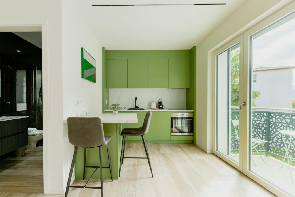
Earthy kitchen colours are not just a Pinterest idea any more. In 2026, they are what homeowners are actually choosing when the plans come out and the samples hit the worktop. For a long time, grey kitchens felt like the safe option. They looked tidy, modern and easy to live with. Honest truth is, a lot of them aged fast. Now people want kitchens that feel warmer, softer and more grounded, especially in family homes where the kitchen has to feel lived in rather than showroom perfect.
In our experience, the shift is not about chasing fashion for the sake of it. It is about choosing colours that sit better with timber, stone, brass, natural plaster tones and the way British light actually behaves through the day. Worth getting right the first time, because painted cabinetry is one of the biggest visual decisions in the whole room.
Why Earthy Kitchen Colours Are Replacing Grey Kitchens
Grey had a strong run because it felt clean and neutral. The problem is that many of the popular greys leaned cold, especially once you paired them with white walls, chrome handles and bright LED lighting. On a sample board they could look sharp. In a real home on a damp February afternoon, they often felt flat.
That is the main reason earthy kitchen colours have taken over. They still give you a calm base, but they do it with more warmth and a lot more character. A good taupe, mushroom, clay white or olive tone has a bit of depth to it. It works with natural textures instead of fighting them. It also tends to age more gracefully because it is tied to materials and setting, not a trend that was everywhere all at once.
We are also seeing homeowners tire of kitchens that feel too sterile. The kitchen is where family life happens. It is where coats get dumped, homework gets done and someone is always making tea. Warmer colours help the room feel settled and practical rather than overdesigned.
What Earthy Kitchen Colours Actually Mean in Practice
Earthy kitchen colours does not mean everything has to be brown or dark. It usually means colours with warmer undertones that feel connected to natural materials. The best schemes are often quieter than people expect.
- Warm whites: softer than brilliant white, with cream, chalk or putty underneath.
- Taupes and mushrooms: a proper middle ground between beige and grey, without the coldness.
- Sage greens: still popular, but usually muddier and more muted now, less pastel.
- Deep olive: richer, more grounded and especially good on islands or lower units.
- Terracotta and clay accents: best used through tiles, paint details, stools or dressers rather than every cabinet.
- Ochre and muted mustard notes: small doses can lift a room beautifully if the rest of the palette is calm.
A good rule is this: if the colour looks like it belongs next to oak, stone, linen, aged brass or handmade tiles, you are in the right territory. If it looks icy or overly blue, it probably is not going to give you that warm earthy feel people are after.
How Earthy Kitchen Colours Behave in Different Light
This is where a lot of people go wrong. A colour is never just a colour on its own. It changes massively depending on the room orientation, window size and what is reflecting back into it.
North-facing kitchens
These rooms get cooler light, so earthy kitchen colours need enough warmth in them to stop the room feeling dull. Mushroom, putty, clay white and olive with a yellow base usually work better than anything too grey-green. A north-facing kitchen can make the wrong paint look lifeless very quickly.
South-facing kitchens
You can get away with more depth here because the light does some of the lifting. Sage, olive and warmer taupes all come alive nicely. Terracotta accents also feel far more natural in a bright room than they do in a darker one.
Small kitchens or shaded extensions
In tighter spaces, warm does not have to mean dark. Often the best answer is a soft warm neutral on the main run, then a slightly deeper tone on an island, dresser or pantry cupboard. That keeps the room open while still giving it personality.
A good joiner will tell you to test large painted samples in the actual room, morning and evening, not just under the lighting in a paint shop. It is the kind of thing you notice every day once the kitchen is fitted.
Painted Joinery in Warm Earthy Tones: Done Well vs Done Badly
Warm earthy colours look brilliant on bespoke cabinetry when the prep is right. They also show poor workmanship faster than people expect. Because these colours often have more pigment and depth, patchy prep or cheap paint can make the finish look tired before the kitchen has even settled in.
Done properly means the timber or MDF is prepared cleanly, edges are filled and sanded properly, the right primer is used, and the topcoat is chosen for durability as much as colour. Sprayed finishes can look excellent, but only when the prep work underneath is right. Hand-painted finishes can look superb too, especially if you want a bit more softness and character. What matters most is consistency, adhesion and a finish suited to kitchen use.
Done badly usually looks like this: rough grain telegraphing through, brush marks in the wrong places, thin coverage on edges, colour mismatch between doors and end panels, and paint that was chosen from a pretty swatch rather than for how it performs near heat, grease and daily knocks. We have seen this go wrong plenty of times. The colour gets blamed, when the real problem is the prep.
If you are investing in painted cabinetry, ask what system is being used, what primer is going on first, and how the finish will hold up around handles, corners and sink areas. Worth getting right the first time.
Pairing Earthy Cabinets With Natural Materials
This is where the whole look comes together. Earthy kitchen colours work best when the supporting materials feel honest and tactile. Natural oak open shelving, oak internals, stone worktops with soft movement, unlacquered or aged brass hardware, and handmade style tiles all sit comfortably with these colours.
Sage and olive tones pair especially well with oak because both have that natural, settled feel. Warm whites and taupes are brilliant if you want the timber to do more of the talking. Terracotta works best as an accent through splashbacks, lampshades, bar stools or floor details, rather than trying to make every element shout at once.
The key is balance. If the cabinets are deep olive and the worktop is heavily patterned and the splashback is busy and the hardware is highly polished, the room can feel overworked. Keep one or two things as the stars and let the rest support them.
How to Choose the Right Warm Tone for Your Space
If you are choosing colours for a new kitchen, start with the room itself before you start with trends. Look at the natural light, the flooring, the adjoining rooms and the materials you know you want to keep or bring in.
- If your room is dark, lean towards soft warm neutrals or lighter sage tones rather than heavy browns.
- If you want a timeless scheme, taupe, putty and olive are safer long-term choices than anything too yellow or orange.
- If you love bolder warmth, bring terracotta or ochre in through accents first and see how much is enough.
- If you already have oak flooring or beams, test colours that complement that warmth rather than compete with it.
- If you are unsure, pick the cabinet colour only after worktop, flooring and hardware samples are on the table together.
In our experience, the best kitchens do not rely on one trendy shade. They combine a grounded cabinet colour with materials that will still feel right years down the line. That is why this move beyond grey looks like it has sticking power. It is less about fashion, more about creating a kitchen that feels good to walk into every day.
Thinking about a new kitchen or bespoke joinery project? Give us a call on 07904 794280 or message us on Facebook. We are always happy to talk through what is possible.